Switch Panel Updates
Christopher Edwards
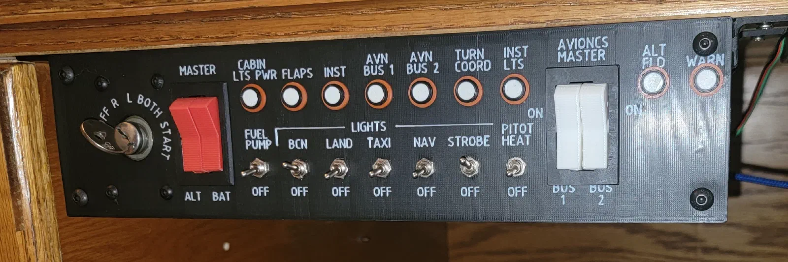
Refining the Switch Box: Panel Labels and Two-Color 3D Printing
Project Journal / Engineering Build Log
Project: Cessna 172 Flight Simulator Subsystem: Aircraft-Style Switch Box Focus: Panel labeling, text sizing, and two-color 3D printing Status: Iterative refinement
Refining the Switch Box
With the switch box taking shape mechanically and electronically, the next area that needed attention was the panel itself.
The switches were in place, but the panel still needed clear labeling to make it feel like a finished cockpit component rather than a collection of prototype parts.
The goal was to develop a labeling approach that looked appropriate for the aircraft-inspired design while also working within the limitations of 3D printing.
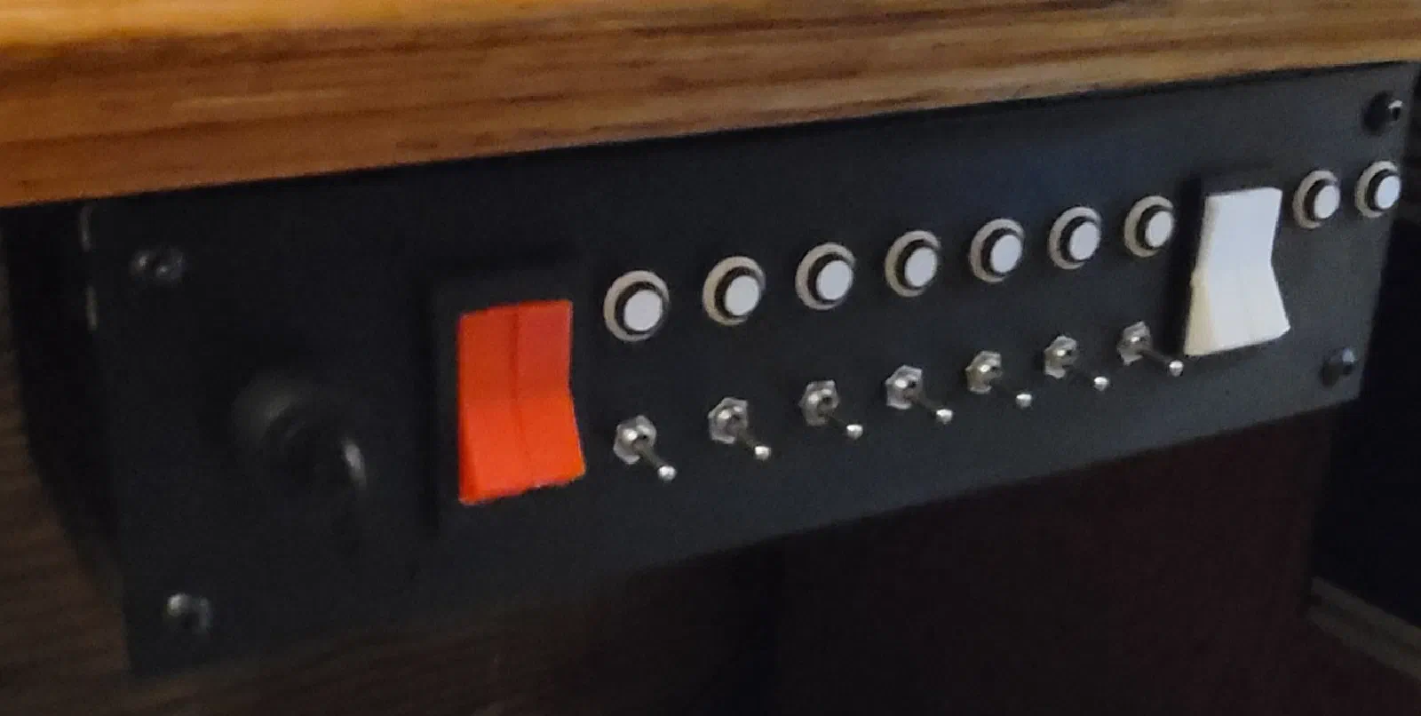
What initially seemed like a simple problem—adding text to the panel—turned into another round of design and manufacturing experimentation.
The Labeling Challenge
The panel needs to communicate what each switch does without making the front face look crowded.
For this project, I wanted the labels to feel integrated into the panel rather than looking like text added to a 3D-printed prototype as an afterthought.
That meant considering several things:
- Font size
- Font style
- Text spacing
- Label placement
- Contrast against the panel
- Consistency between different switches
- How the lettering would actually print
The last point became particularly important.
What looks perfectly readable on a CAD screen doesn’t necessarily translate into readable lettering on a physical 3D print.
Designing for Two-Color 3D Printing
One approach I explored was using two-color 3D printing to create the labels.
Rather than printing the panel in one color and adding labels afterward, the lettering could be incorporated directly into the printed part.
The basic concept was:
Panel color → contrasting lettering → finished integrated label
This provides a clean result without requiring separate labels, decals, or paint.
It also makes the lettering part of the physical panel rather than something applied afterward.
The difficulty is that two-color printing introduces another set of constraints.
The text has to be large enough and have enough separation between individual characters for the printer to reproduce it reliably. Fine details that look good in CAD can disappear once they are printed.
Text Size Matters More Than Expected
One of the more useful lessons from the process was how much text size affects the finished result.
I initially approached the text primarily from a visual standpoint. If it looked correct on the computer screen and fit within the available space, it seemed like it should work.
The physical prints told a different story.
Small text quickly became difficult to read. Narrow characters lost definition, and closely spaced lettering started to visually blend together.
This meant that the available panel space couldn’t be the only consideration when selecting the font size.
The label needed to satisfy two requirements:
- Fit the available space.
- Remain readable after printing.
The second requirement ultimately became the more important one.
Printing Test Pieces
Rather than repeatedly modifying the entire switch box, I created smaller test sections specifically for evaluating the labels.
This made it possible to experiment with:
- Different font sizes
- Different character spacing
- Different text depths
- Different label orientations
- Different amounts of spacing between switches
A small test print is considerably faster to produce than an entire panel, and it provides a much better indication of what the final lettering will actually look like.
This became an important part of the iterative design process.
The CAD model provided the starting point, but the printer ultimately determined whether the design worked.
Finding the Practical Limit
The goal wasn’t necessarily to find the smallest text that could be printed.
Instead, I wanted to find the smallest text that could be comfortably read.
Those are two very different limits.
A printer might technically reproduce a particular character at a small size, but that doesn’t mean the resulting label is useful on the finished panel.
For a simulator control, the labels need to be readable from the normal pilot seating position rather than being inspected from a few inches away.
This is especially important for a simulator intended to reinforce cockpit familiarity and checklist workflows. The controls shouldn’t require excessive visual effort just to determine what a switch does.
Refining the Label Layout
Once the text size was better understood, the next step was refining the actual layout.
The labels needed to work with the physical switches rather than compete with them.
This involved adjusting:
- Horizontal and vertical alignment
- Distance between the switch and its label
- Spacing between adjacent labels
- Relationship between labels and panel edges
- Consistency across groups of switches
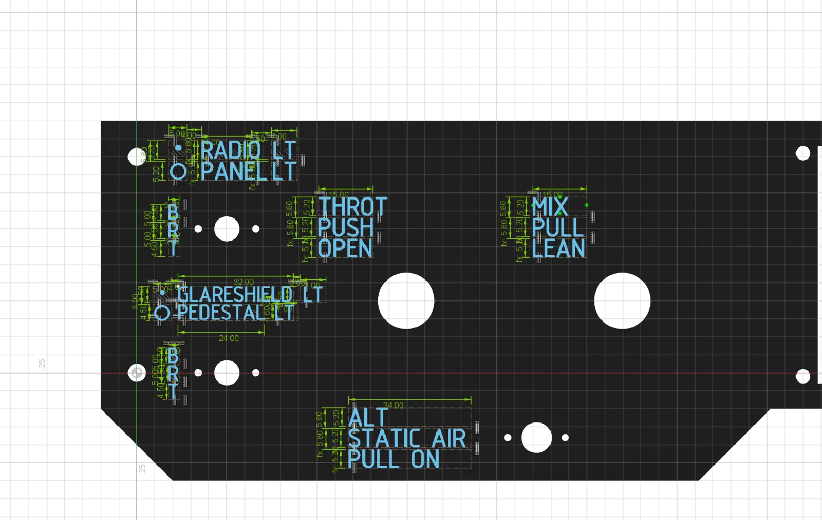 Small alignment changes made a surprisingly large difference.
A switch that was only slightly offset from its label could make the entire group look uneven. Establishing consistent spacing became just as important as getting the text itself correct.
Iterating the CAD Model
The labeling changes were incorporated directly into the Fusion 360 model.
Keeping the labels in the CAD model makes the panel design easier to revise as the switch box evolves.
Rather than treating the labels as a final cosmetic step, I treated them as another part of the mechanical design.
This means that changes to switch locations, panel dimensions, or the control layout can be reflected in the labeling without having to recreate the artwork separately.
What Worked
The two-color printing approach proved to be a practical way of producing integrated panel labels.
When the text is large enough and the contrast is good, the result looks much more like part of the panel than an applied label.
It also provides a repeatable manufacturing process.
Once the CAD model and print approach are established, the same technique can be applied to additional panels and future revisions.
The biggest takeaway is that the lettering needs to be designed around the manufacturing process.
The ideal text size isn’t determined solely by the available panel space or what looks good in CAD. It also has to account for printer resolution, character geometry, spacing, viewing distance, and the contrast between the two materials.
Lessons Learned
Design for the Printed Result
CAD provides an excellent way to visualize a panel, but small details need to be validated with physical prints.
Don’t Push Text Too Small
There is a point where making text smaller saves space but significantly reduces usability. For this project, readability is more important than fitting the maximum amount of information onto the panel.
Test Before Printing the Entire Panel
Small test pieces make it much easier to evaluate different text sizes and styles without wasting time and material on full-panel prints.
Labels Are Part of the Mechanical Design
The labeling shouldn’t be treated as artwork added at the end. Switch locations, spacing, panel geometry, and text all need to work together.
Looking Back
The labeling work was one of those parts of the project that initially appeared straightforward but required several iterations to get right.
It reinforced a recurring theme throughout the simulator build: the physical implementation often exposes problems that aren’t obvious in the CAD model or on the computer screen.
The final panel isn’t just about having the correct switches. The spacing, labeling, tactile controls, and overall appearance all contribute to how convincing and usable the simulator feels.
Build Status: Panel labeling and two-color printing approach established.